Mwamba is a sustainable mining start-up that is helping transition small-scale gold miners in Tanzania to safer mining practices. There are over 15 million small-scale gold miners in 70 countries, the majority of whom extract gold from ore using mercury, a neurotoxin that makes people sick, and eventually causes death with enough exposure. When mercury is used in mining, it also leaks into rivers and waterways where it poisons the general population as well as aquatic life and other animals.
Mwamba's model is to transition miners away from mercury processing to safer more modern processing methods, while at the same time providing miners with higher incomes. I am proud to have applied my skills to help them communicate the important work they are doing to the world.
My Role
I was hired to design the Mwamba website and create a brand look and feel, including designing their logo and some marketing materials, such as their newsletter and executive summary.
The Website Design Process
Even though this was a simple marketing site rather than a complex app, I still always start out by creating wireframes, so that the client and I can focus on the overall structure and flow of information first. This site needed to be especially storytelling focused, as the issues they are addressing are ones that the general public knows very little about. I had to thoroughly familiarize myself with the subject matter of small-scale gold mining in order to be able to present the information in a way that made most sense.
Wireframe for the homepage
After getting approval on all the wireframes, the next stage was to dive into the visual design. I first created a mood board, which luckily the client loved on the first round, so I applied those styles to the entire site to create a cohesive look and feel.
Mood board
Below is the finished homepage design for the site. I created a handful of custom icons, and wrote the majority of the copy in this mockup. I'm a fairly decent copywriter, but I always prefer to work with a professional when it is in the client's budget. In this case, the client also stepped in to provide great copy for the final site.
I am really happy with how all the designs turned out. Please check out the live website at https://mwambamining.com/.
One of my big challenges was helping the user to understand why Mwamba is better, knowing that many people looking at this site would know very little about gold supply chains. Small custom UI components such as the one above help to get the idea across that Mwamba's supply chain is more direct and retains more value for the miners.
This custom slider allows the viewer to easily grasp the difference in health effects and amount of gold recovered from traditional vs. modern mining processing.
Logo Design Process
The vast majority of the work I do is in UX and interface design, but logo design is something I do enjoy, especially for a client as special as Mwamba.
Logo Design Round 1
My first step is always to sketch out a number of ideas. For this my favorite tool is Procreate on my iPad with an Apple Pencil, as it instantly digitizes my ideas.
Below are the initial sketches that I presented. I was a big fan of the two circular ones on the upper left, but the client felt they looked too much like logos for a non-profit. I still think they are strong marks, so hopefully one day they will find a home with another organization!
Logo sketches
Logo Design Round 2
I refined and continued to explore their favorite directions from the sketches I presented previously. The client was most interested in seeing the logos below more fully flushed out.
Final Logos
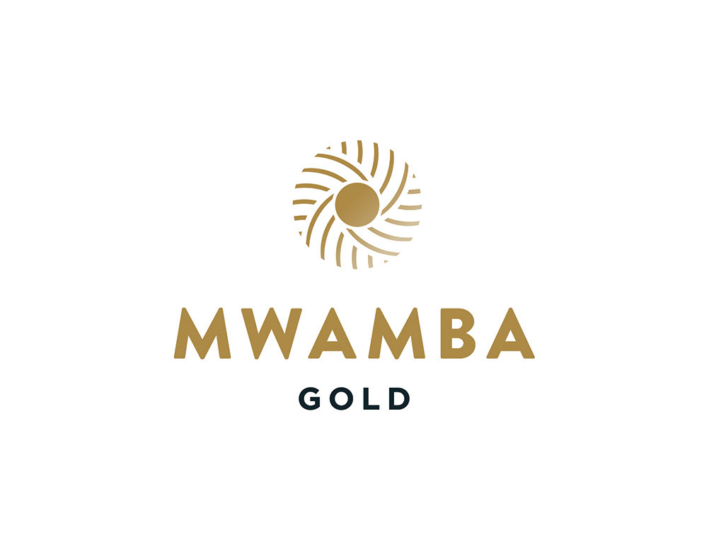
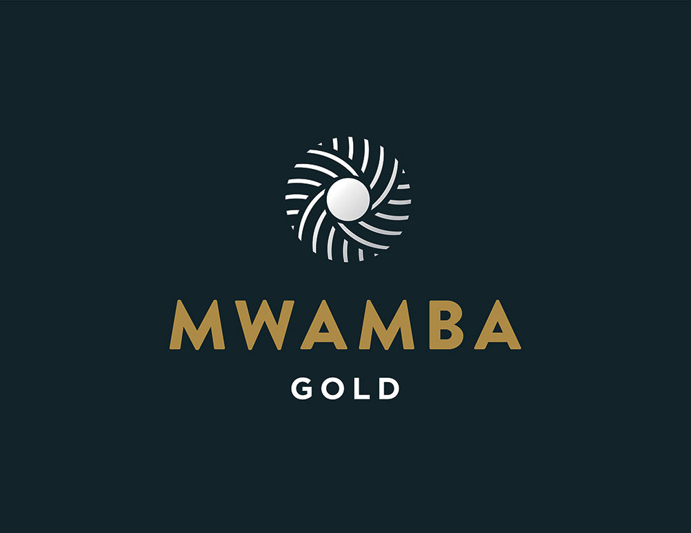
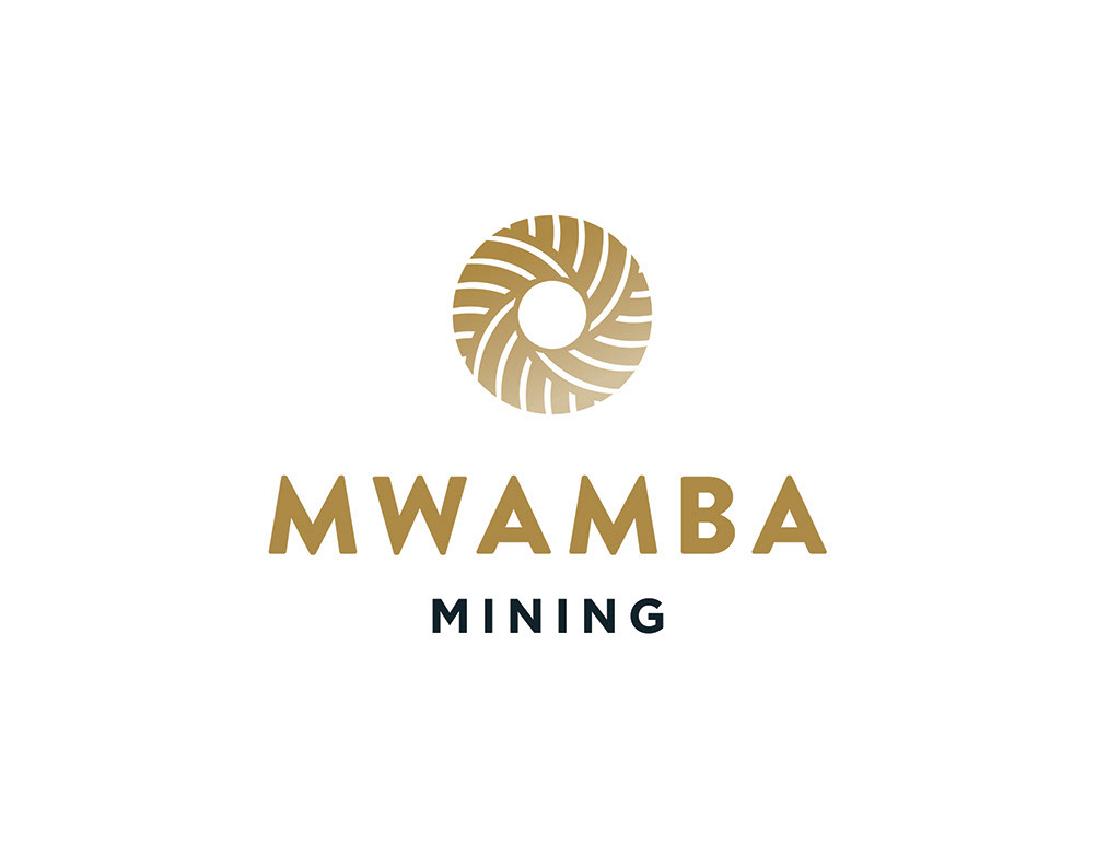
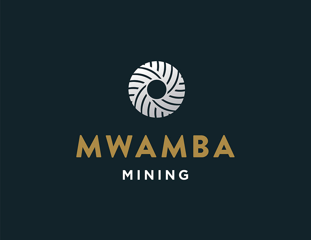
After seeing the second round of logos, the client loved the one on the far right, so I further refined it to make every vector perfect. I created two versions for them, one that they could use for their mining organization, and another that they could use for their gold sales company. The two logos work very harmoniously together as one is simply the reverse of the other.
Below are the final designs for the logos. I gave the client options for several different color combinations, gradients, and layouts, so they could use whatever worked best for the space, background color, and accompanying elements.


Thanks for visiting! The website is now launched: https://mwambamining.com/.